| Version 3 (modified by , 18 years ago) ( diff ) |
|---|
Proposed Web Inspector UI Refresh
The general idea is the resources sidebar takes up a lot of room and features of the current inspector are hard to find or use. So these mock-ups remove the resources sidebar and provides you with 4 sections—Elements, Resources, Databases and Scripts. The section names represent the fundamental items you will work with inside the respective sections.
Elements
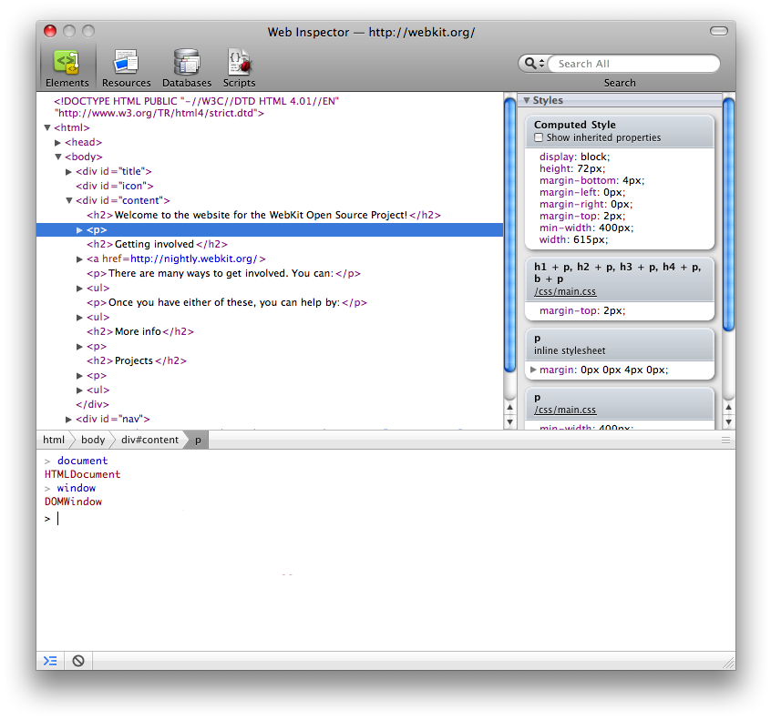
The first mock-up is the Elements section. This is the DOM tree, with the ability to dig into nested frames. This mock-up also shows the console open at the bottom. When the console is opened, the bottom bar animates up to reveal the console underneath.
You might notice we have a different looking search field too. This is based on the design in iPhoto 7, which has a search scope selection menu. The default scope would search everything, and the selector menu would let you pick an area to search. This could also be flipped, where the current scope if based on the current section and you switch it to search everything.
The status bar below the console has the console toggle button and a clear console button. We also talked about adding scope buttons to that bar to filter the console content as desired.
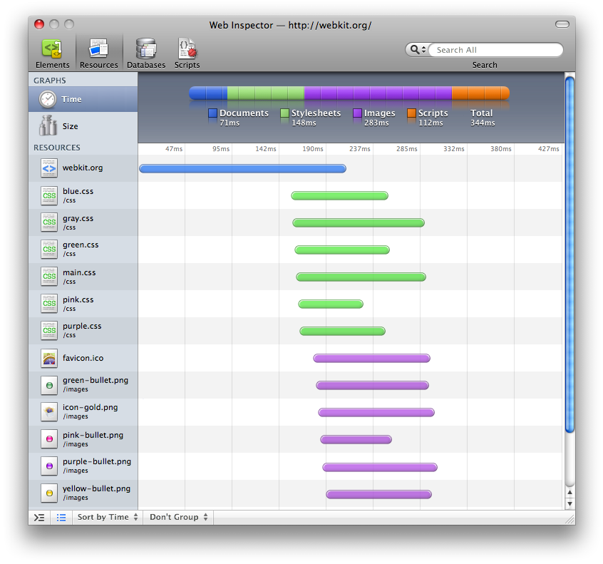
The next mock-up is the Resources section—a combination of the network timeline and the source view. This mock-up shows taller rows using file icon mode, which can be toggled in the status bar. When using file icon mode each row has an icon, and for image resources the icon would include a preview (not shown.) The status bar also has various controls to change shorting and grouping of the resources. We would have: don’t group, group by type and group by document (or frame). There are also two sorting modes: sort by time and sort by size. The sorting modes control what the graph shows, so when sorting by size the bars would graph file size.
Resources
The first mock up shows the Time graph. There are two graph types that we would have—Time and Size. When in a graph view you will see a summary graph and a line graph corresponding to the resources in the sidebar. The sorting and the graphs are disconnected, so you can change the sorting while still looking at the Time or Size graph.
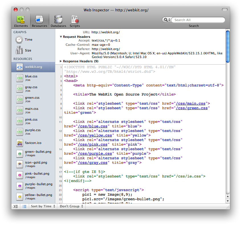
When you click on a resource, the graphs is replaces with the source view (or preview for images). The source view has the full URL and headers at the top. Also when you click on a resource the alternating rows in the sidebar fade out, since they are not useful when looking at the source.
Scripts
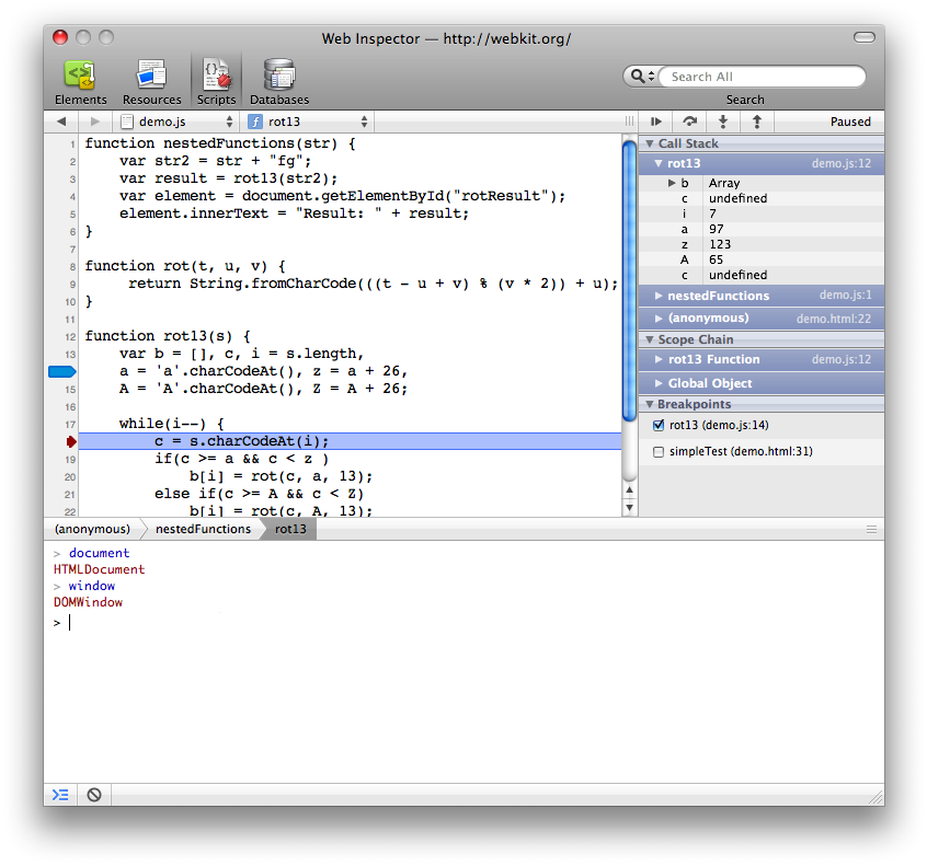
Conserving space was a main focus, so there is no resource sidebar and everything is usable when docked. The file picker is in the header row, like Xcode with back/forward buttons. Next to the file picker is the function popup menu, to jump to functions in the file. On the right side is a sidebar that is similar to the Elements sidebar. This sidebar contains the Call Stack, Scope Chain and Breakpoints sections. I think it would help to separate the call stack and the scope, instead of combining them like Dashcode. It would help debug complex cases, like retuning closures. Above the sidebar are the debugging controls to pause, resume and the standard step operations. Below the source code are breadcrumbs that also reflect the call stack, for quick reference. Like the other sections, the console can be shown at the bottom. When the console is hidden, the breadcrumbs and the toggle console button sit on the same status bar (and the clear console button hides).
Attachments (4)
-
New Inspector - Elements.png
(146.9 KB
) - added by 18 years ago.
Mockup of the Inspector's Elements view
-
New Inspector - Resources 3.png
(141.9 KB
) - added by 18 years ago.
Mockup of the Inspector's Resources view showing the Time graph
-
New Inspector - Resources 3.1.png
(226.3 KB
) - added by 18 years ago.
Mockup of the Inspector's Resources view showing a resource's source
-
New Inspector - Scripts.png
(151.0 KB
) - added by 18 years ago.
Mockup of the Inspector's Scripts view
Download all attachments as: .zip


