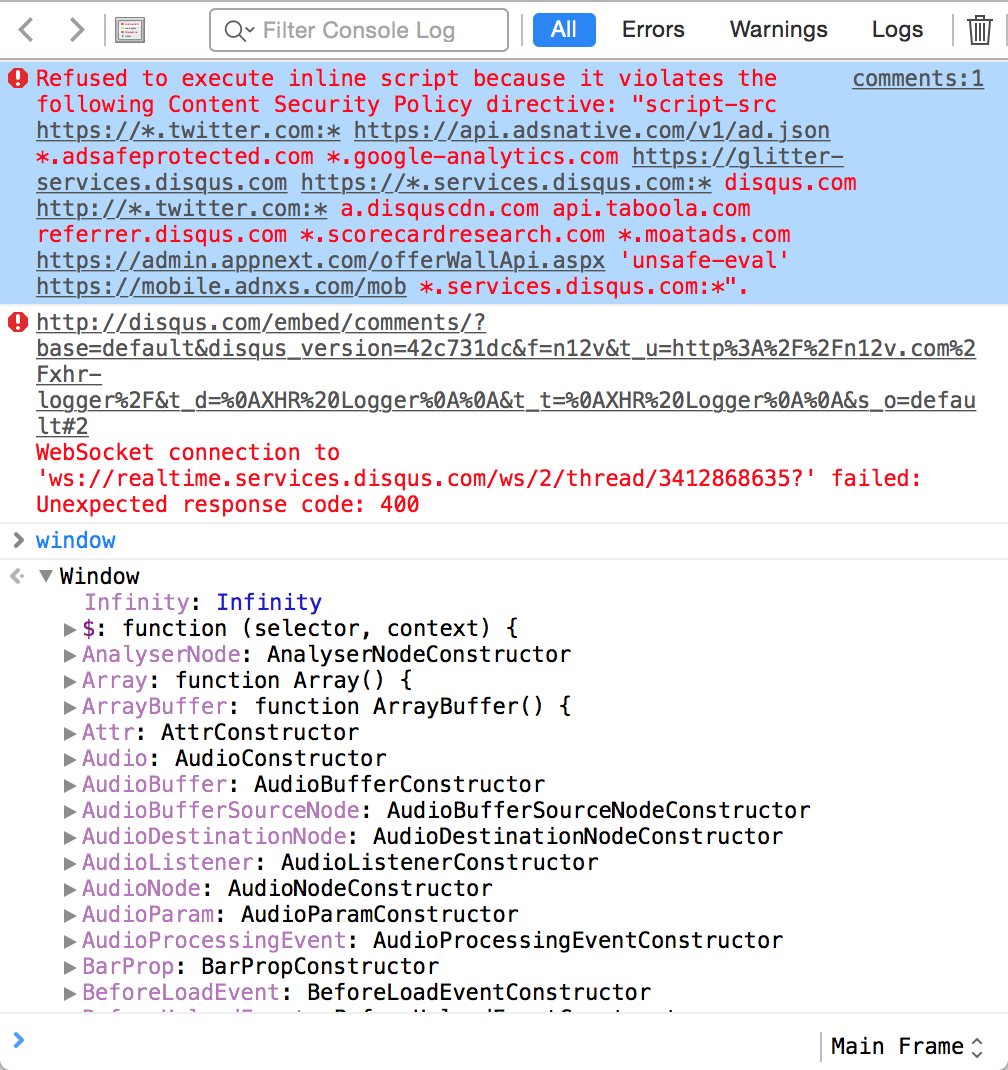
Current style
Selected errors are hard to read:
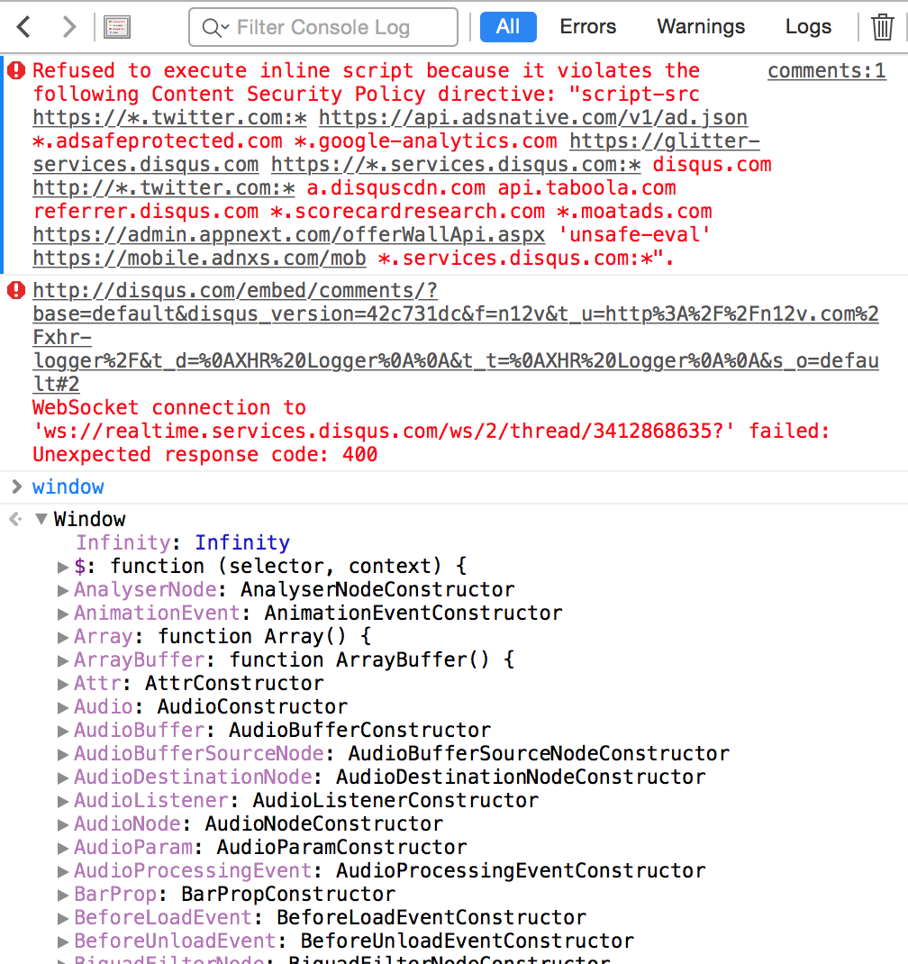
Proposed solution #1
This 2px bar on the left might be hard to notice. I think it shouldn’t attract too much attention because we use only to do two things:
- copy a message
- expand/collapse a message
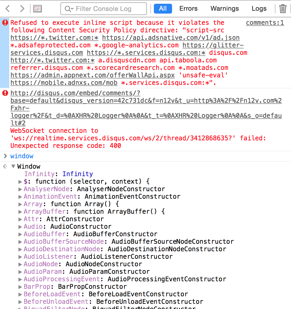
Proposed solution #2
This may require to make console icons on the left darker.
Last modified
11 years ago
Last modified on Jan 13, 2015, 1:18:10 AM
Note:
See TracWiki
for help on using the wiki.


