
| Version 3 (modified by , 16 years ago) ( diff ) |
|---|
Styling Form Controls Using Pseudo Classes
WebKit provides a way to give CSS styles to form controls. Some form controls can be styled through pseudo classes. This article will illustrate how we can customize their appearances using the pseudo classes.
<progress>
You can customize <progress> element by -webkit-progress-bar-value pseudo class.
An example following:
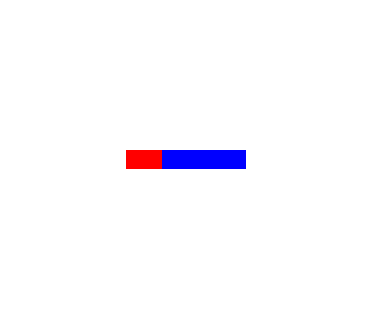
progress.custom {
    -webkit-appearance: none;
    background-color: blue;
}

progress.custom::-webkit-progress-bar-value {
    background-color: red;
}
In this example, we first disable the default visual by -webkit-appearance: none,
then give styles, one for <progress> element itself, another for its "bar" part.
With this tyle, following HTML fragment...
<progress class="custom" min="0" max="100" value="30" />
...looks like:

Of course, we can also set properties other than background-color.
<meter>
As <progress>, <meter> can be customized by pseudo classes.
But it's more complicated because <meter> has three different 3 states (optimal, suboptimal and even-less-good)
and 2 directions (horizontal and vertical).
WebKit defines 8 pseudo classes to handle them:
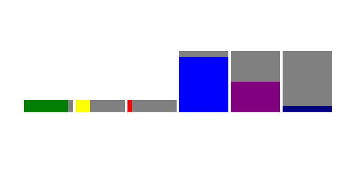
  meter.custom::-webkit-meter-horizontal-bar { background: gray; }
  meter.custom::-webkit-meter-horizontal-optimum-value { background: green; }
  meter.custom::-webkit-meter-horizontal-suboptimal-value { background: yellow; }
  meter.custom::-webkit-meter-horizontal-even-less-good-value { background: red; }
  meter.custom::-webkit-meter-vertical-bar { background: gray; }
  meter.custom::-webkit-meter-vertical-optimum-value { background: blue; }
  meter.custom::-webkit-meter-vertical-suboptimal-value { background: purple; }
  meter.custom::-webkit-meter-vertical-even-less-good-value { background: white; }
Note that background "bar" part has directions, but has no state.
With this style, following HTML fragment...
  <meter class="custom" style="height:20px; width:80px;"
               min="0" max="100" low="30" high="60" optimum="100" value="90" ></meter>
  <meter class="custom" style="height:20px; width:80px;"
               min="0" max="100" low="30" high="60" optimum="100" value="30" ></meter>
  <meter class="custom" style="height:20px; width:80px;"
               min="0" max="100" low="30" high="60" optimum="100" value="10" ></meter>
  <meter class="custom" style="height:100px; width:80px;"
               min="0" max="100" low="30" high="60" optimum="100" value="90" ></meter>
  <meter class="custom" style="height:100px; width:80px;"
               min="0" max="100" low="30" high="60" optimum="100" value="50" ></meter>
  <meter class="custom" style="height:100px; width:80px;"
               min="0" max="100" low="30" high="60" optimum="100" value="10" ></meter>
...looks like:

<meter> variations
On Mac OS X, WebKit provide multiple built-in appearances for <meter>.
-webkit-appearance: continuous-capacity-level-indicator;(Default)-webkit-appearance: discrete-capacity-level-indicator;-webkit-appearance: relevancy-level-indicator;-webkit-appearance: rating-level-indicator;
You can find the rendering result in the test suite:


<input> element
Coming soon...
Attachments (3)
-
custom-meter.png
(8.0 KB
) - added by 16 years ago.
A <meter> screenshot
-
custom-progress.png
(5.6 KB
) - added by 16 years ago.
A <progress> screenshot
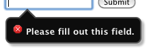
- validation-bubble-styled.png (5.7 KB ) - added by 15 years ago.
Download all attachments as: .zip